
Farm Profitability Indexing
Farm Profitability Indexing
Late in 2015, I picked up on some interesting farm financial info during a presentation I attended as a part of CAFA. This information represents farms from a geographically vast cross section and revealed some interesting trends:
1. Gross Revenue per Acre has Trended Up
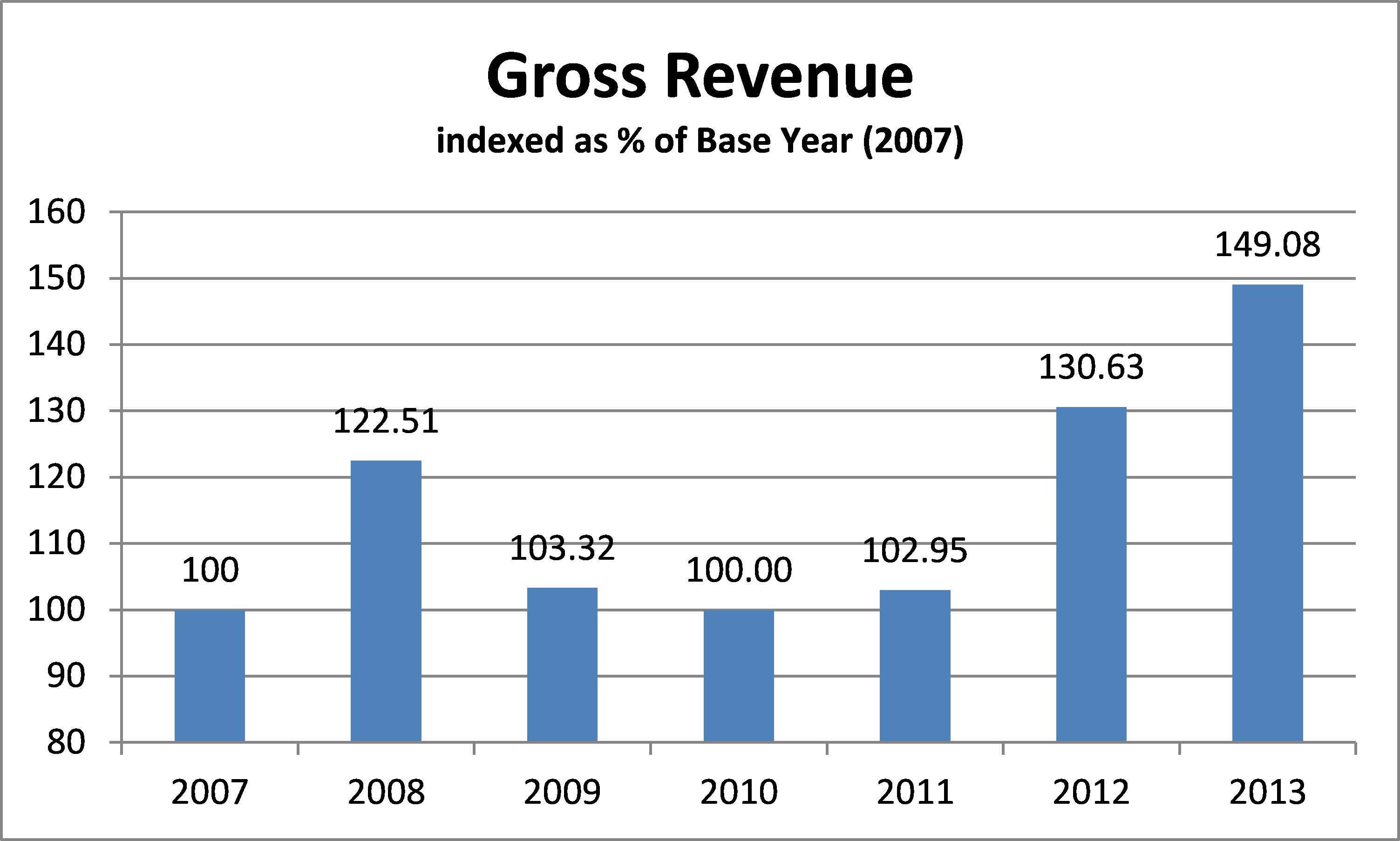
With 2007 being the base year with a value of 100, and also being the first year of the bull run in commodity prices, we can clearly see that while gross revenues are trending up, there is still great volatility in gross farm receipts. True, weather anomalies had a significant effect, but that’s farming, isn’t it?
2. Investment in Crop Inputs per Acre has Trended Up
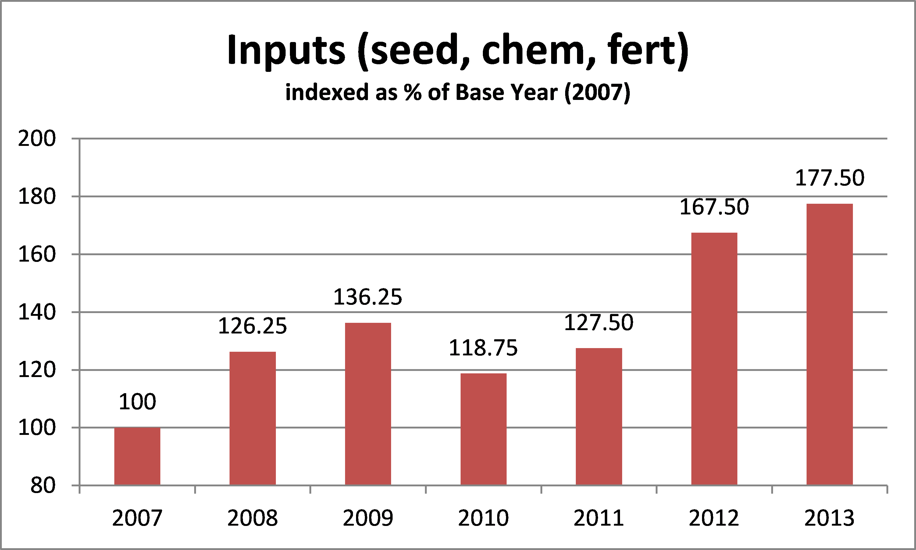
While gross revenue has seen volatility, and for three years including 2009-2011 gross revenue was at or near 2007 revenue levels, investment in inputs has only once seen a reduction year over year. In 2013, investment in inputs was 77.5% higher per acre than it was in 2007.
3. Gross Margin per Acre has Trended Up
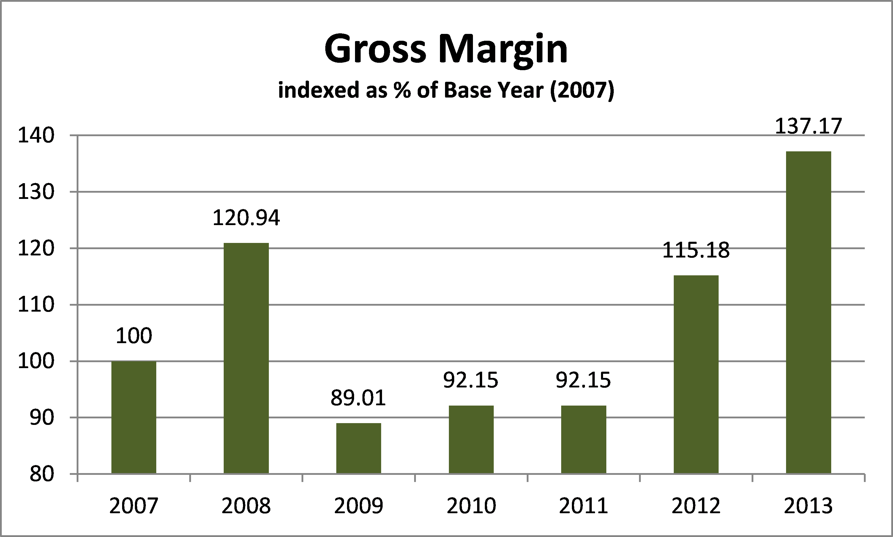
While gross margin is trending up, there was a significant decline in 2009 from the previous year that extended right through 2011. Even by 2012, gross margin had not returned to 2008 levels.
4. Operating and Fixed Costs per Acre are Trending Up
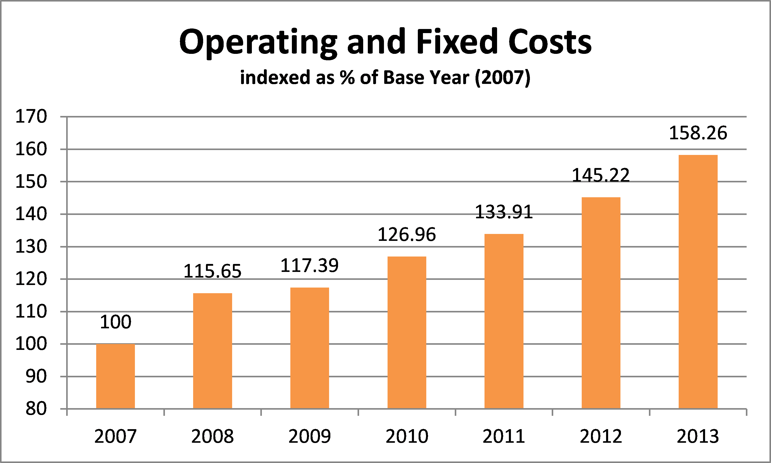
This figure would represent operating costs such as fuel, labor, and equipment costs, as well as fixed costs such as interest, land, and building costs. Notice the steady increase that has never went down year over year, even through the low margin years of 2009-2011 operating & fixed costs continued to rise.
5. Net Income per Acre has Rebounded from Significant Reductions
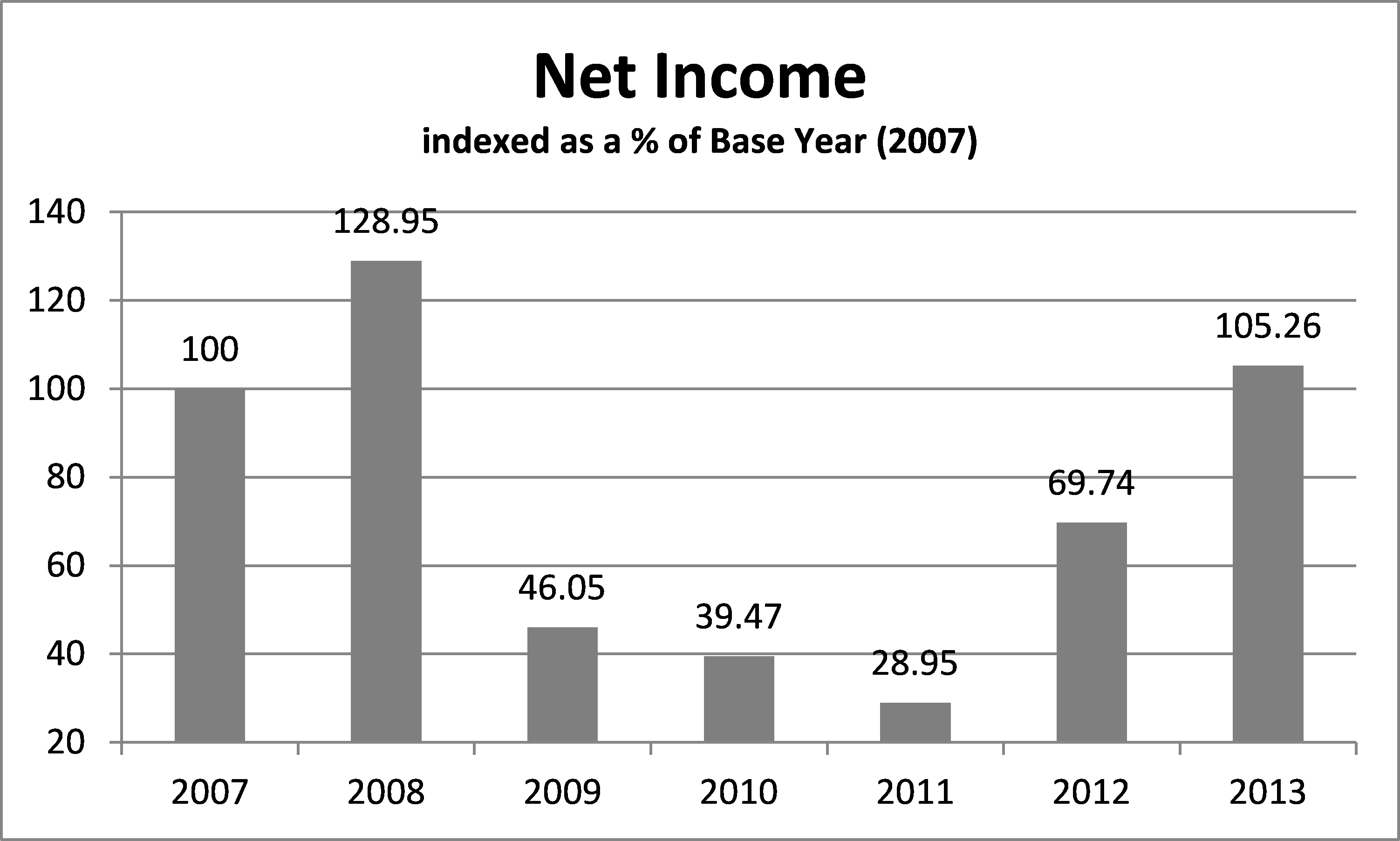
Net Income represents what is left over after operating your business, that profit which remains to cover administrative costs, make principal loan payments, and cover that other insignificant cash requirement: living costs (that was sarcasm if you couldn’t tell.)
In this illustration, we have calculated Net Income simply as Gross Margin LESS Operating & Fixed costs. Here we see that the low margin years of 2009-2011 actually extend right to 2012 with net income still below that of our base year 2007. This is the residual effect of increasing costs during a period of low margins (2009-2011) by continuing to have a negative effect on what would otherwise be a successful year in 2012.
Everything Dips but Expenses
This chart illustrates a dangerous trend: even when income goes down, operating & fixed expenses are allowed to continue to rise.

By the end of 2011, net income had dropped to less than 30% of 2007 levels, yet operating and fixed costs were over 145% of 2007 levels. It took 2013 bringing about the largest crop in maybe forever to elevate net income back to 2007 levels.
Direct Questions
If Net Income represents the funds you have generated to cover living costs and make loan payments, how well does your worst net income from the last 10 years cover your living and loan payments in 2016?
What does the trend of your gross income, input costs, operating costs, and net income look like since 2007? Is it similar to what’s been presented here? What changes have you made to your operation based on your own information?
Gross margin should ideally be in lock step with operating and fixed costs. If you aren’t increasing your gross margin, why are you increasing your costs?
From the Home Quarter
This is a very telling experiment, but it is not the rule on all farms. The information presented here is an average across a list that spans all regions of the prairies, but heavily weighted on Saskatchewan. The experiment gets more interesting when you apply it to your own business. To lean on the 5% Rule first promoted by Danny Klinefelter, if in 2013 you could have been 5% better than the average in gross revenue, input costs, and operating & fixed costs as presented here, your net income would be 44% better than information presented, and index to 152.14% of the 2007 base year.
How does that sound?


Leave a Reply
Want to join the discussion?Feel free to contribute!